Mitigating Risk at Every Stage of the Product Development Lifecycle

Your website attracts visitors, but conversions remain below expectations. Users abandon forms halfway through. Support tickets flood in about confusing navigation. Analytics show high bounce rates but provide no clear explanation why.
These symptoms point to user experience problems costing you revenue daily:
- Visitors leaving within seconds because they cannot find what they need.
- Potential customers abandoning purchase flows due to friction points.
- Users encountering difficulties with interfaces that may appear intuitive internally.
- Revenue lost to competitors offering smoother experiences.
- Brand damage from frustrating interactions users remember negatively.
The solution requires systematic evaluation through a structured UX audit template. Rather than guessing which elements frustrate users, comprehensive audits reveal exactly where experiences break down and how to fix them.
What is a UX Audit?
A UX audit systematically evaluates digital products to identify user experience problems, usability issues, and opportunities for improvement. Unlike subjective opinions about design preferences, audits apply structured frameworks examining interfaces against established principles and user behavior data.
The process combines expert analysis, user testing, analytics review, and technical validation. Experts evaluate interfaces against heuristics and best practices; user testing reveals real friction points through observation, while analytics quantify behavioral patterns showing where users struggle. Both UX audit and heuristic evaluation methodologies provide systematic approaches to uncovering experience issues.
Comprehensive audits produce prioritized findings with specific recommendations. Rather than generic advice to “improve usability.”
Documentation includes screenshots, severity ratings, and implementation guidance enabling teams to act immediately. Organizations conduct UX audits to diagnose declining metrics, prepare for redesigns, benchmark against competitors, validate design decisions, or maintain experience quality over time.
When Should You Run a UX Audit
Strategic timing maximizes audit value by addressing problems when fixes deliver the greatest impact. Certain situations particularly benefit from systematic UX evaluation using standardized templates.
Before Major Redesigns or Rebuilds
Redesign projects benefit enormously from audits identifying current experience weaknesses. Understanding existing problems prevents repeating mistakes in new designs. Audits reveal which elements work well and should remain versus which require fundamental rethinking.
Baseline audits before redesigns also enable measuring improvement afterwards. Comparing pre- and post-redesign audit scores quantifies whether new designs actually enhance experiences or merely change them.
When Metrics Decline Unexpectedly
Sudden drops in conversion rates, engagement, or other key metrics signal user experience problems requiring investigation. Website UX audit templates provide systematic frameworks for identifying root causes rather than guessing what changed.
Analytics show that problems exist but rarely explain why. Audits combine quantitative data with qualitative evaluation, revealing the specific friction points causing metric degradation. Understanding how UX design shapes efficiency helps teams recognize when declining metrics stem from design issues versus external factors.
After Launching New Features
New feature launches introduce changes affecting existing user flows and mental models. Post-launch audits verify that additions integrate smoothly without creating confusion or friction elsewhere.
Features working perfectly in isolation sometimes create problems when combined with existing functionality. Comprehensive evaluation catches unintended consequences before they damage adoption or satisfaction.
During Competitive Pressure
When competitors improve their offerings, maintaining competitive user experiences requires understanding your relative position. Comparative audits benchmark your product against competitors, identifying gaps and opportunities.
Regular competitive auditing prevents surprises by tracking industry evolution. Staying ahead requires knowing not just your current state but also how quickly standards advance.
On Regular Maintenance Schedules
Proactive organizations schedule audits quarterly or annually regardless of obvious problems. Regular evaluation catches issues early when fixes cost the least while preventing experience degradation over time.
Products evolve continuously through small changes. Without periodic comprehensive review, accumulated minor problems compound into major user frustration.

Website UX Audit Template: Step-by-Step Framework
This comprehensive framework provides systematic approaches for conducting thorough website evaluations using proven UX audit template methodologies. Follow these steps sequentially for complete coverage.
Define Audit Goals and KPIs
Clear objectives focus audit efforts on areas delivering maximum value. Without defined goals, audits risk becoming unfocused explorations producing irrelevant findings.
Effective goal setting includes:
- Business Objectives Alignment: Connect audit purposes to strategic priorities like increasing conversions, reducing support costs, or improving retention.
- Specific Questions to Answer: Identify particular concerns driving the audit, such as why mobile conversion lags desktop or which checkout steps cause abandonment.
- Success Metrics Definition: Establish how you’ll measure whether post-audit improvements succeed through metrics like task completion rates, time on task, or error frequencies.
- Scope Boundary Setting: Define precisely which products, features, user flows, or pages the audit covers, preventing scope creep.
- Stakeholder Agreement: Confirm decision-makers align on goals and will support implementing findings.
Document goals clearly, sharing them with audit participants and stakeholders, ensuring everyone understands what the evaluation aims to accomplish.
AnalyzeUser Behavior Data
Quantitative data reveals where users struggle even when qualitative reasons remain unclear. Begin audits by examining existing
analytics,
Data analysis includes the following:
- Traffic Patterns Review: Examine which pages receive traffic, how users navigate between sections, and where they enter or exit.
- Conversion Funnel Analysis: Identify where users abandon critical flows like signup, checkout, or onboarding and track drop-off rates at each step.
- User Flow Mapping: Visualize common paths through products, understanding intended versus actual user journeys.
- Heatmap Analysis: Review click, scroll, and attention heatmaps showing what captures interest and what gets ignored.
- Session Recordings: Watch real user sessions identifying confusion, errors, and friction points.
- Performance Metrics: Check page load times, error rates, and technical issues affecting experience quality.
Analytics provide objective evidence of problems. A 60% abandonment rate on checkout page three demands investigation regardless of design opinions.
Conduct Heuristic Evaluation
Heuristic evaluation systematically assesses interfaces against established usability principles, providing expert perspective on design quality.
Standard evaluation includes Nielsen’s ten usability heuristics:
- Visibility of System Status: Users always know what the system is doing through appropriate feedback.
- Match Between System and Real World: Interface language matches user mental models rather than technical terminology.
- User Control and Freedom: Users can easily undo actions and navigate freely without feeling trapped.
- Consistency and Standards: Similar elements behave similarly by following platform conventions.
- Error Prevention: Design prevents mistakes before they occur through constraints and confirmations.
- Recognition Rather Than Recall: Users recognize options rather than remembering commands or sequences.
- Flexibility and Efficiency: Interfaces accommodate both novice and expert users with appropriate shortcuts.
- Aesthetic and Minimalist Design: Every element serves clear purposes without unnecessary decoration.
- Help Users Recognize and Recover from Errors: Error messages clearly explain problems and solutions.
- Help and Documentation: Assistance is accessible when needed without overwhelming default experiences.
Rate each heuristic on severity scales, noting specific violations with screenshots. Document precisely where designs violate principles and how violations affect users.
Evaluate Information Architecture
Information architecture determines whether users find what they seek or abandon it in frustration. An IA evaluation examines organization, labeling, navigation, and search.
An IA assessment includes:
- Navigation Structure Analysis: Review menu organization, depth, and breadth, assessing whether groupings match user mental models.
- Labeling Evaluation: Verify navigation labels clearly describe destinations without jargon or ambiguity.
- Search Functionality Testing: Assess whether search helps users find content when browsing proves difficult.
- Taxonomy Review: Examine categorization schemes, ensuring logical organization supporting multiple user approaches.
- User Path Analysis: Map routes users take accomplishing key tasks, identifying detours and dead ends.
- Mobile Navigation Assessment: Verify IA works effectively on small screens without overwhelming limited space.
Poor information architecture can make it harder for users to find content. Well-designed IA makes finding information intuitive regardless of entry point or task.
Assess UI Design and Visual Consistency
Visual design quality affects credibility perceptions, emotional responses, and usability through hierarchy and emphasis. UI/UX audit checklists specifically target design evaluation.
UI assessment examines:
- Visual Hierarchy: Important elements receive appropriate emphasis through size, color, position, and contrast.
- Consistency: Similar elements look and behave similarly, creating predictable patterns throughout.
- Color Usage: Color choices support readability, guide attention appropriately, and work for users with vision impairments.
- Typography: Fonts enhance readability while reinforcing branding with appropriate sizing and hierarchy.
- Spacing and Layout: White space and element arrangement support scanning and comprehension.
- Component Library Adherence: Interfaces use established design system components rather than one-off custom elements.
- Brand Alignment: Visual elements accurately reflect brand guidelines and personality.
- Responsive Design: Layouts adapt appropriately across device sizes.
Document design issues with annotated screenshots highlighting problems and suggesting improvements.
Test Accessibility Compliance
Accessible design serves users with disabilities while improving experiences for everyone through clearer structure and more robust implementations. Accessibility audits verify WCAG compliance and assistive technology compatibility.
Accessibility testing includes:
- Keyboard Navigation: All functionality works without mouse input, supporting motor impairments and power users.
- Screen Reader Compatibility: Content and interactions work properly with assistive technologies like JAWS or NVDA.
- Color Contrast Ratios: Text and background combinations meet WCAG AA or AAA standards supporting vision impairments.
- Alternative Text: Images include descriptive text enabling screen reader users to understand visual content.
- Form Labels and Instructions: Inputs provide clear guidance programmatically associated with labels.
- Heading Structure: Semantic headings create logical document outlines supporting navigation.
- Focus Indicators: Keyboard users see which element currently has focus through visible indicators.
- Error Identification: Error messages clearly explain problems and solutions without relying solely on color.
Use automated tools for initial scans, then conduct manual testing with actual assistive technologies, validating real user experiences.
Review Content and Messaging
Content quality determines whether users understand offerings and trust organizations enough to engage. A content audit evaluates clarity, completeness, tone, and scannability.
Content review examines the following:
- Clarity and Comprehension: Messages communicate clearly without jargon or unnecessary complexity.
- Reading Level Appropriateness: Language suits target audience education and expertise levels.
- Completeness: Content provides information users need for confident decision-making.
- Scannability: Structure supports quick scanning through headings, bullets, and short paragraphs.
- Tone and Voice Consistency: Language matches brand personality and user expectations throughout.
- Call-to-Action Effectiveness: Prompts clearly explain desired actions and benefits.
- Error Message Quality: Instructions help users understand and fix problems.
- Microcopy Polish: Small text elements like button labels and form instructions use clear, helpful language.
Note specific examples of confusing, incomplete, or poorly written content requiring revision.
AnalyzeMobile Experience
Mobile traffic dominates for most products. Mobile-specific evaluation ensures touch interfaces and small screens receive appropriate design attention.
Mobile analysis includes the following:
- Touch Target Sizing: Buttons and links meet minimum size requirements for accurate tapping.
- Responsive Layout Quality: Designs adapt appropriately to various screen sizes without breaking.
- Mobile-Specific Features: Capabilities like click-to-call or GPS integration work correctly.
- Text Readability: Font sizes remain readable on small screens without zooming.
- Form Input Optimization: Appropriate keyboard types appear for different input types.
- Horizontal Scrolling Absence: Pages avoid requiring horizontal scrolling, which creates awkward interactions.
- Orientation Handling: Interfaces work in both portrait and landscape orientations.
- Mobile Performance: Pages load quickly over cellular connections.
Test on actual devices rather than desktop browser emulators, catching real-world issues simulators miss.
Evaluate Performance and Speed
Technical performance affects user experience regardless of design quality. Slow pages can negatively affect user experience even when beautifully designed.
Performance evaluation includes:
- Page Load Times: Measure initial page loads and subsequent navigation speed.
- Time to Interact: Assess when pages become usable rather than just visible.
- Resource Optimization: Check image compression, code minification, and caching strategies.
- Third-Party Script Impact: Identify external resources slowing pages unnecessarily.
- Mobile Performance: Test over cellular connections, simulating real user conditions.
- Error Rates: Monitor technical failures affecting reliability.
- Database Query Efficiency: For dynamic content, assess backend performance.
Use tools like PageSpeed Insights, Lighthouse, or WebPageTest to collect objective metrics supporting findings.
Benchmark Against Competitors
Competitive benchmarking reveals whether experiences lead, match, or lag industry standards. Relative position matters as much as absolute quality.
Competitive analysis includes:
- Feature Comparison: Identify capabilities competitors offer that you lack.
- Flow Efficiency: Compare task completion steps and time between products.
- Visual Design Quality: Assess aesthetic sophistication relative to competitors.
- Performance Metrics: Benchmark load times and technical quality.
- Content Quality: Evaluate clarity and completeness of competitive messaging.
- Mobile Experience: Compare mobile implementations and feature parity.
- Innovation Identification: Note unique approaches competitors use successfully.
Document findings objectively, focusing on user experience differences rather than subjective preferences.
UX Audit Report Template
Structured UX audit report templates communicate findings effectively to diverse stakeholders. Well-organized reports transform observations into actionable improvements.
Executive Summary
Executive summaries provide high-level overviews for decision-makers needing strategic understanding without implementation details.
Include in executive summaries:
- Overall Assessment: One-paragraph characterization of current user experience quality and maturity.
- Critical Issues: The three to five most severe problems requiring immediate attention with brief impact descriptions.
- Business Impact: Quantified or estimated implications for revenue, conversion rates, support costs, or other key metrics.
- Investment Required: Rough estimates of resources needed for addressing major findings.
- Expected Outcomes: Anticipated benefits from implementing priority recommendations.
- Strategic Direction: High-level guidance on whether products need incremental improvements or fundamental rethinking.
Keep summaries to one page maximum. Busy executives often read only this section before approving resources.
Methodology
Methodology sections explain evaluation approaches, lending credibility to findings and enabling result interpretation.
Methodology documentation includes:
- Evaluation Methods Used: List specific approaches like heuristic evaluation, user testing, or analytics analysis.
- Audit Scope: Define precisely which products, features, pages, or user flows received evaluation.
- Evaluation Criteria: Explain the standards against which interfaces were assessed.
- Participants: Identify who conducted the evaluation and their qualifications.
- Timeline: Note when evaluation occurred and duration.
- Limitations: Acknowledge scope boundaries or methods not used.
A clear methodology prevents questions about finding validity while helping teams replicate audits later.
Key Issues Identified
The issues sections catalog significant problems discovered during evaluation, organized for easy comprehension.
Effective issue documentation includes:
- Issue Descriptions: Clear explanations of problems discovered with specific examples.
- Severity Ratings: Classification as critical, high, medium, or low based on user impact.
- Frequency: How often are users likely to encounter problems?
- Affected Users: Which user segments experience issues.
- Screenshots: Visual documentation showing problems clearly.
- Current vs. Best Practice: Comparison showing how implementations diverge from standards.
Group-related issues reveal systemic causes rather than isolated symptoms.
Impact Analysis
Impact analysis helps stakeholders understand business consequences, motivating investment in improvements.
An impact assessment includes the following:
- User Experience Effects: How problems affect satisfaction, efficiency, or understanding.
- Business Metric Implications: Estimated effects on conversion rates, revenue, retention, or support costs.
- Brand Perception: How issues affect trust, credibility, or competitive positioning.
- Technical Debt: Long-term consequences if problems remain unaddressed.
- Opportunity Cost: Benefits lost by not addressing issues.
Recommendations
Recommendations translate findings into specific actions teams can implement.
Strong recommendations include:
- Specific Changes: Precise descriptions of modifications needed.
- Implementation Guidance: Suggestions for creating improvements efficiently.
- Alternative Approaches: Multiple solution options when single answers aren’t obvious.
- Success Criteria: How to verify improvements work as intended.
- Effort Estimates: Rough sizing helps teams plan resources.
- Dependencies: Prerequisites or related changes needed.
Frame recommendations positively, emphasizing opportunities rather than criticizing current states.
Roadmap and Next Steps
Roadmaps sequence improvements logically, considering dependencies, resources, and strategic timing.
Implementation roadmaps include:
- Prioritization Rationale: Explanation of recommended sequencing based on impact and effort.
- Quick Wins: High-impact, low-effort changes delivering fast results and building momentum.
- Phases: Logical groupings of improvements into sprints or releases.
- Dependencies: Which fixes must precede others.
- Timeline Estimates: Realistic completion targets for improvement phases.
- Success Metrics: How to measure whether changes improve experiences.
- Review Checkpoints: Scheduled evaluations of progress and course corrections.
Balance immediate improvements demonstrating progress with longer-term structural enhancements requiring sustained effort.
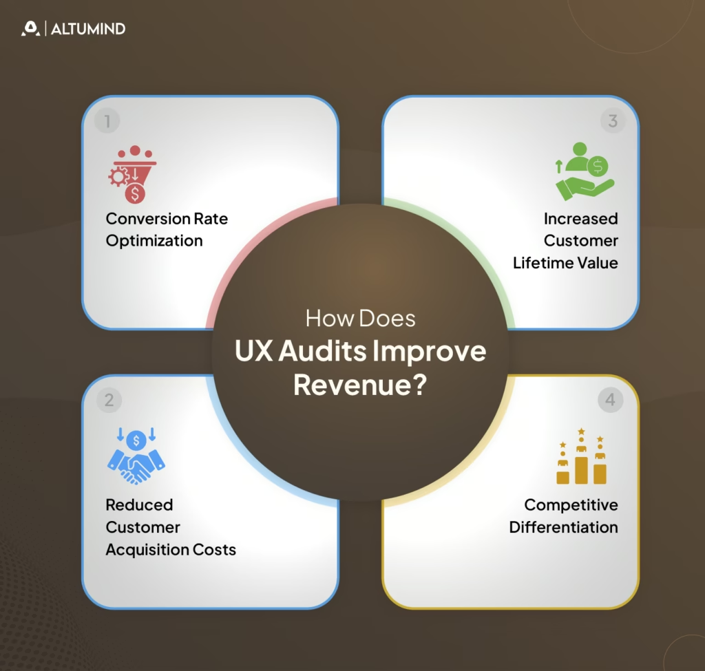
How Does UX Audits Improve Revenue?
User experience quality directly impacts revenue through multiple mechanisms. Understanding these connections helps justify audit investments and prioritize findings. Discovering what UX audits reveal about lost revenue transforms abstract quality concerns into concrete business opportunities.
Conversion Rate Optimization
Friction in conversion flows directly reduces revenue. Each abandoned cart, incomplete signup, or dropped checkout represents lost income. UX audits identify and remove conversion barriers.
Revenue improvements come from:
- Simplified Forms: Reducing required fields increases completion rates.
- Clearer CTAs: Obvious next actions prevent decision paralysis.
- Trust Building: Security signals and testimonials reduce abandonment.
- Mobile Optimization: Smooth mobile checkout captures mobile commerce.
- Error Reduction: Preventing form validation failures maintains momentum.
Even modest conversion improvements generate substantial revenue increases. A 2% conversion lift on $10M revenue adds $200,000 annually.
Reduced Customer Acquisition Costs
Better user experiences improve conversion rates, making each visitor more valuable. Higher conversion means lower cost per acquisition even with unchanged traffic costs.
CAC improvements include:
- Better Landing Pages: Relevant, clear messaging converts more paid traffic.
- Improved Onboarding: Smooth activation increases paid trial conversions.
- Reduced Bounce Rates: Engaging experiences keep users exploring longer.
- Mobile Performance: Fast, smooth mobile experiences capture mobile search traffic.
When paid advertising drives traffic, conversion improvements directly reduce acquisition costs, improving marketing ROI.
Increased Customer Lifetime Value
Positive experiences drive retention, repeat purchases, and upsells, increasing customer lifetime value. Poor UX pushes customers to competitors, reducing LTV.
LTV improvements include:
- Better Retention: Satisfying experiences reduce churn.
- Increased Engagement: Enjoyable products see higher usage, driving habit formation.
- Feature Discovery: Clear interfaces help users find valuable capabilities.
- Upgrade Motivation: Smooth experiences make premium tiers attractive.
- Referral Generation: Delighted users recommend products to others.
LTV improvements compound over time as better experiences build loyalty and advocacy.
Competitive Differentiation
Exceptional user experiences differentiate products in crowded markets. When features become commoditized, experience quality determines purchase decisions.
Differentiation benefits include:
- Premium Pricing Power: Superior experiences justify higher prices.
- Market Share Gains: Better UX attracts customers from inferior competitors.
- Brand Reputation: Excellence builds word-of-mouth and organic growth.
- Reduced Price Sensitivity: Great experiences make users less likely to switch for small savings.
User experience becomes increasingly important as feature parity reduces other differentiation opportunities.
UX Audit Template: Quick Copy Version
This simplified template provides frameworks for rapid internal audits when comprehensive evaluation isn’t required. Copy and adapt this structure for your specific needs.
Step 1: Define Goals
- Identify specific questions to answer.
- Set success metrics.
- Define audit scope boundaries.
- Align stakeholders on objectives.
Step 2: Analyze Data
- Review analytics for problem areas.
- Check conversion funnel drop-offs.
- Examine heatmaps and recordings.
- Identify high-traffic pages needing attention.
Step 3: Evaluate Usability
- Test against Nielsen’s heuristics.
- Check consistency across pages.
- Verify error prevention and recovery.
- Assess feedback and system status.
Step 4: Review UI and Content
- Evaluate visual hierarchy.
- Check brand consistency.
- Assess content clarity.
- Verify scannability.
Step 5: Check Accessibility
- Run automated tools.
- Test keyboard navigation.
- Verify color contrast.
- Check screen reader compatibility.
Step 6: Test Mobile Experience
- Verify responsive behavior.
- Check touch target sizes.
- Test performance on devices.
- Validate form inputs.
Step 7: Analyze Performance
- Measure load times.
- Check PageSpeed scores.
- Test on slow connections.
- Identify optimization opportunities.
Step 8: Benchmark Competitors
- Compare key features.
- Assess visual quality.
- Evaluate flow efficiency.
- Note innovation opportunities.
Step 9: Document Findings
- Organize by severity.
- Include screenshots.
- Write specific recommendations.
- Estimate implementation effort.
Step 10: Prioritize Actions
- Identify quick wins.
- Plan improvement phases.
- Create an implementation roadmap.
- Schedule follow-up reviews.
Conclusion
Systematic user experience evaluation through comprehensive UX audit templates transforms subjective opinions into measurable improvements. The structured approaches outlined enable organizations to identify friction points costing revenue, prioritize fixes delivering maximum impact, and measure success through objective metrics.
Effective audits balance multiple evaluation methods, including expert review, user testing, analytics analysis, and technical validation. UX audit report templates communicate findings clearly to diverse stakeholders, while UI/UX audit checklists target specific design quality dimensions.
Implementation success requires translating observations into actionable recommendations with clear priorities and realistic roadmaps. Organizations embedding systematic UX audits into product development cycles catch problems early when fixes cost the least.
Altumind helps organizations establish comprehensive user experience evaluation practices, delivering measurable business impact. Our UI/UX services combine systematic auditing with strategic design improvements, transforming insights into enhanced experiences that drive conversion, retention, and revenue growth.
Let's Connect
Reach out and explore how we can co-create your digital future!